 |
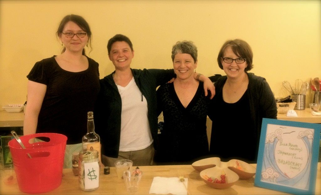
| Broadcraft Press: Kate Shuknecht, Meghan Maloney-Vinz, Meg Masterson, Julia Jenson |
Top 3 reasons we don't make our books in China:
2.) We like to play with paper. For real. It's fun to make books. Do you think we would do this if it wasn't fun?
3.) We like to collaborate. With each other, with our authors, with the available materials. There's a great deal of joy and creative satisfaction from everyone having input at every step of design and production.
_____
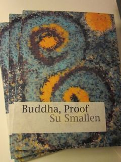
That was the answer I got from Kate Shuknecht (far left), editor, designer, and instigator of St. Paul's Broadcraft Press, home to Su Smallen's 2012 Minnesota Book Award nominee, Buddha, Proof, and several other book by local authors as care-fully crafted as they are conceived and written, in response to my first question. Here now is the rest:
CGB: Tell us about the origins of Broadcraft Press. I know the four of you got started making books in grad school, but when or how did that turn into something serious?
KS: It
was all four of us and that was... Jesus, I might even have to read our own bio. I believe the first project we did was the 2007
edition of Rock, Paper, Scissors (Hamline University's Graduate School of Liberal Studies' literary magazine), but it wasn’t until over a year later that we decided
we really liked doing and this, and we should keep doing it. We had an initial
project, Angel, by Haley Lasche, but then didn't have anything else lined up after that, and didn't know how
much time we'd have to work on one if we did, 'cause at the time three of us were still in school.
We kind of joke about how we're still a part-time press. Because we're all employed
otherwise and have other artistic endeavors. We don’t crank out a bunch of
books each year, but that also has to do with our belief in quality vs. quantity.
Where then can people find your books? And how many do you make, on average?
We've
done the most runs of Buddha, Proof, for sure. The finalist space for the Minnesota Book Award was fantastic
publicity. We’re non-traditional in that when people ask where they can get our books we say “You should talk to the author,” because our focus is on
collaborating with the author, and then once the book is made, distribution is
entirely up to them. We'd rather put our energy and time into the creative
aspect. And nobody markets a book like an author.
So you meet authors half way?
It kind of rose out of a time constraint but became part
of the ideals we embrace. Even the numbers we put out are a sort of collaboration. The author usually has a number in mind, and budget, and so
it depends on their ideas and also the design of the book. So if we're working on a
handbound book, we typically don’t like to do a run of more than 50 because it's so labor intensive, but if it's perfect bound we can do more. But still fairly
small, like 100-150, just to keep in line with our limited edition philosophy; the artifact that's neither rare nor mass produced.
All of your books look different. How do you decide which type of book to make in terms of binding and design? Are you involved in each stage of production?
Right, there are so many different
kinds of hand-stitching you can do. It depends on the look of the book: how it
feels, how it looks, how it opens. Perfect bound, where you stack the sheets and glue along the binding, is something we outsource, because we don’t
have the facilities for that ourselves. That’s what we did for the last run of
Buddha, Proof and for Jean Larson's book, Superior Life, as well.
Where's that done?
Well, once we have the design finalized with the author, we send out emails to people that we know just to get quotes, and often times it comes down to who's within our budget and has time. But because printers
are more used to massive runs, timing isn’t usually an issue. Oh, and local printers, always. We tend to contact those that
are smaller, family owned and operated businesses, like Gary at Griffith Printing. He’s small and old school; his emails are terse and to the point. I love
it. It's like dealing with a New Yorker.
Who does what at Broadcraft Press?
We're all pretty equal in the
spit-balling stages and design collaboration. We all chime in pretty evenly with ideas. But when the design starts to get more finalized, each of us has a section that
we head. Mine is more labor intensive. When there are things we need to
fold, insert, or glue, I do the bulk of that work. Julia does the bulk of the
layout; she's our design guru when it comes to InDesign. Meghan does a lot of
the running around, buying our paper, taking it to the printer.
Meghan's great at the administrative stuff as well.
What's next?
We're
working with Jen March, again. Not making a book though. We’re helping her
design… hmm... it might be more fun just to tease this and release it. Oh, well, we’re making
cards for her to advertise the 2nd Co-Kisser Poetry-Film Festival. On the one
side's information and the other is a poem about film. So, it’s not a book,
but it's definitely literature. The festival is Oct 16th at Minneapolis College of Art and Design. It’s
a cool way for poets and writers and filmmakers to get together.
Do you have a favorite book you've done or memory of making one, so far?
This
is gonna sound like the safe answer, but it's honest: I have a favorite moment from
each project that we've worked on. I so enjoyed working on the cover of Buddha,
Proof, though. That was so unexpected. We tried a lot of different covers before Meg had this
idea in the middle of the night and couldn’t sleep. She's a nanny and one thing
she does with the kids is play with colored sand and rice, and so she said "Let's
play with colored rice and see what happens." It was so fun playing with this rice in Meghan's basement based on Meg's idea, and at the time it was our least
likely option, but it turned out to be incredible.
So that cover is a picture of actual colored rice?
Yea, it’s a picture of colored rice that we swirled
around a white board. And we didn’t do too much else with it, really. The added
texture's from the linen paper.
Huh, I assumed it was a computer generated image.
Probably most people think that. Which is extra funny because it's Buddha. I think there are several poems in which rice is mentioned.
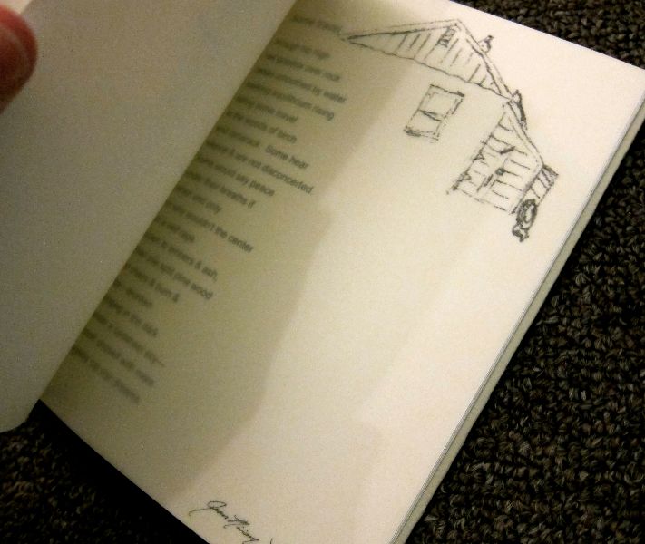
Jean Larson's book was great fun, too. Jean is a visual
artist, on top of being a poet, so once we found a way to make the vellum work, because it tends to bend and tear, the poetry became more powerful when complemented by her sketches, and it fits her need to have that particular book in the world. The paper is thin, like wax paper but thinner, so it's translucent, but you still can print on top of it. So every time a sketch appears you see the poem on the other side. That's the challenge and the fun of it: having a great idea and then figuring out how the hell you pull it off.
No comments:
Post a Comment